· 6 min read
Jason Walsh

Yesterday, I shared this video by HealthyGamerGG on YouTube. It's a 30-minute video and not everyone may have time to watch it all (though I encourage you to do so if you can find time, it's incredibly educational).

In this article, I want to succintly summarize the concepts for anyone who can't watch the full video.

Concept 1 - Daily Dopamine Is Limited

  • The Nucleus Accumbens releases Dopamine, the feel good hormone
  • Dopamine can be released when completing difficult or boring tasks, but only if any remains in your daily supply
  • When its depleted, we typically lack motivation to do even simple tasks

The analogy HealthyGamerGG used was squeezing a lemon. At first, with minimal effort, you get a lot of juice, but later you have to really squeeze the lemon to get the last few drops.

Applications

  1. Do hard work when you wake up
  2. Don't engage in recreational activities until the end of the day

Real world example: Waking up and playing videogames for an hour before work / studying consumes a lot of your daily dopamine making your work day (or studying) harder.

Concept 2 - Negative Affect Creates Cravings For Dopamine

If you are depressed or anxious, you are more likely to spend your dopamine on tasks you inherently enjoy instead of work / studying.

In other words, if you're in a bad or depressed mood, work and studying become even harder than they normally would be.

Suggestions

Take care of yourself before trying to focus on hard activities.

Engage in activities to reduce your negative affect and stabilize your mood (this can be easier said than done in some cases):

  • Walking / working out
  • Journaling
  • Therapy
  • Meditating
  • Thinking through negative emotions

Concept 3 - Willpower Is A Subconscious Decision-Tree

When we think about hard tasks like studying or work, our subconscious engages in a sort of decision-tree where it asks "which will generate dopamine more easily: working / studying or something fun?".

Often, this leads to choosing the fun activity to release dopamine quickly.

This is the essence and science behind procrastination. We are constantly choosing the more-fun activity because we get more dopamine creating a feedback-loop that we should keep doing that until we can't anymore.

Hacking The Decision-Tree - Playing the tape through the end

HealthyGamerGG asks the question, "When an essay is due tomorrow and we've procrastinated until the last minute, why don't we just blow it off completely? Why and how can we actually manage to write the essay?".

The answer is what he describes as Playing the tape through the end. For example, if we don't complete the essay that's due tomorrow, then we will get a zero on that essay, which will lower our grade, which will cause us to be less likely to pass the class, which could require taking the class again or risk not getting the diploma for which we're striving.

His suggestion here is when you have difficult tasks where you know you're likely to procrastinate or not engage in it ever, physically write out (with pen and paper) the end of the script.

Example: I'm playing videogames or watching Netflix because those give me dopamine, but there is an AWS course I wanted to study online. I keep putting it off and it's been months. He suggests, I play the tape through the end for the AWS course. Don't look at the start of the journey but the end. In this case: "When I finish the AWS course, I'm going to feel good about having stuck through the entire course and successfully completing it, but more importantly, I'm leveling up my skillset which will help me get a job or makes it more likely that I'll get a raise at my current job".

Here's the mind-blowing part: EVEN IF YOU CHOOSE TO PLAY VIDEOGAMES TODAY, you at least understand the end-result of why you want to take the course and what value you'll get out of it, and that outcome is now factored into your subconscious' decision-tree such that the next time you're thinking about procrastinating, you have a new high-value outcome to consider making it easier for you to start / continue that course.

That's brilliant.

Hacking The Decision-Tree - Novelty

HealthyGamerGG suggests that tasks that are new and novel are more engaging than repetitive tasks.

Here's a great example. I used to partake in a team-building Zoom meeting at work, where we played Codenames online.

At first, everyone was having a blast, but over time others were prioritizing challenging, engaging engineering work over team-bonding because Codenames was getting stale.

Someone introduced Gartic Phone as an alternative to Codenames and suddenly those meetings were incredibly engaging again and everyone began showing back up.

Variety is the spice of life after all. After realizing this, we began mixing and matching online games for those sessions and attendance increased and everyone was more engaged.

Concept 4 - Pain and Pleasure Are Linked

Typically, we have pain-avoidance reactions. Learning, studying, working, working out, they can all be painful, however, some pain can actually increase dopamine output when the task is completed.

HealthyGamerGG uses working out as an example. If you are mindlessly doing reps that aren't really a challenge for you, they aren't as rewarding, making it harder to consistently engage in those activities. However, if you do a really difficult rep and succeed, you feel really good and proud about what you accomplished

Simplify Tasks To The Right Difficulty

When trying to break down tasks into smaller chunks, find the right amount of pain, where you know if you complete that chunk you're going to feel really good and proud of what you achieved, but avoid creating chunks that are so massive, so painful, that it's overwhelming to think about starting.

Bad Example

Someone recommended this book to me, I should buy it and read through it in a single sitting

Good Example - Chunking the work

This will vary person-to-person, but let's say you really hate reading books.

You might chunk the work into these categories:

  • Someone recommended a book, I'm going to buy the book today so I can read it in the future
  • I received the book, I'm going to read the back cover and table of contents
  • I really don't like reading, but I'll feel really proud of myself if I can read 1 chapter or even 1 page

You may not make progress as fast, but you at least have accomplished something you're proud of and you're taking the appropriate steps to progress in your learning.
· 3 min read
Jason Walsh

In my early 20's, I sought career guidance because I didn't know what the heck I was doing. Fresh out of college after landing my first semi-enterprise job as a junior engineer, I knew there was an organizational ladder and I was at the bottom, but wasn't sure how to ascend that ladder beyond trying harder at work.

There were two keys to my early career growth: finding a framework to help me understand how organizations work and reward employees and staying motivated. I want to touch on both briefly.

· One min read
Jason Walsh

tRPC

In an earlier article, I went over a very rudimentary data fetch example using tRPC and Zod, two of my favorite new Node.js libraries.

Today I pushed up a simple demo to Github showcasing how to handle tRPC Mutations (including how you can easily Upsert data) as well as some simple Design Patterns to cut down on boilerplate code.

The demo can be ran locally, but if you prefer to just look at the code, the README has some callouts about the main files worth looking at.

I hope this helps make development easier, faster, and less brittle for you if you're doing development with Node.js.

Cheers 🍻

· 2 min read
Jason Walsh

Today I just finished Traction by Gino Wickman, a 200-page lightweight read that establishes a framework for scaling one's business.

Mr. Wickman argues that businesses will hit organic glass ceilings that they need to break through in order to continue their measured success.

Some topics:

  • The vision and core values: the building blocks that will drive growth
  • Ensuring you have the right people for the right roles and acknowledging that as a business breaks through new glass ceilings, those individuals may not always scale as their department or role has new demands placed upon it (and guidance around resolving these scenarios)
  • Using data to determine the right moments to focus on new growth vs. internal processes / inflection so that you don't cripple your organization by scaling too quickly
  • How to track and resolve Issues, those things that can hinder growth if not addressed
  • Establishing company-wide processes and accountability all the way from executive leadership to individual contributors
  • Lastly, creating a very simple framework that leaders can utilize to competantly assess their departments' health, whether or not they are on track for the goals they set for themselves, and how to keep propelling forward

Conclusion

As I read through its chapters, flashbacks of chaotic moments, confusion, miscommunication or poor communication, and even stagnation surfaced.

Looking back on those memories, it was, at the time, difficult to identify the issues' originations or how to establish swift resolutions. During those periods, it felt like issues would continue to pile up. Many would need to be solved through tough decisions and discomfort, which Gino openly acknowledges.

After having read Traction, I wish I knew about it sooner, which would have led to quicker resolutions, less burden, and more satisfaction amongst the various teams.

Simultaneously, I could now identify when fragments of that framework were unknowingly implemented and how much clarity those organizational stepping stones brought around the trajectory of the company and its health.

If you have an established business and you feel like you've hit a glass ceiling or your business' chaos factor is overwhelming, I encourage you to give Traction a try.

At worst, you lost a few hours reading something unhelpful, at best you've unveiled a toolset to assist you in your company's growth.

Cheers!

· 4 min read
Jason Walsh

The Problem

Clients had the ability to press a Sync Now button to sync data from their systems to ours.

We received feedback early on that it was difficult to find and use, in it's current location on a sub-page, so we moved it to the sidenav where it was always on display. Innocuous decision, right? Simple, elegant. Easy-to-access from anywhere.

Growing Complexity

One day, we ran into our first use-case where a specific client had two systems we needed to sync from.

Shoot, now what? Do we put one Sync Now button for each client integration? Do we display a modal popup and ask which system to sync?

We opted to move the Sync Now button to the integration settings page.

The next morning a new Slack message:

Clients are furious we removed the Sync Now button from the sidenav, we need to hotfix it back. Highest priority.

Multiple Attempts At A Fix

Round 1

So we hotfixed it back while figuring out our game-plan and that's when things became not-so-innocuous. At first we tried to implement a strategy to ask the user what they wanted to sync from a list of integrations that were enabled.

We're getting feedback from most of our customers, who have one integration per property that they are upset they need to take that extra step.

Round 2

When each page loads (because it's on the sidenav), return a list of integrations and so we know if 2 or more are enabled. If so, ask them to select an integration to sync from, otherwise just show the toast popup for "Sync started"

...That worked for a while but over time new problems arose:

  • We said Sync started (processes that can sometimes take 10 minutes or more) when we didn't know if it started because we couldn't keep network requests open for that long. Sometimes it failed due to invalid credentials or misconfiguration, leading to support requests
  • There was no feedback around what synced, if anything. Sometimes it would connect to the integration and re-sync data, but no new data was synced, and furthermore we didn't have a place we could easily showcase how much data we were able to pull over

The Solution

The idea behind the final UI iteration was to move this button to any page where users are checking if their data is synced or needs to be synced. If multiple integrations were enabled that supported syncing data, show a dropdown and have the end-user select the integration they want to sync from.

First, this cuts down on data-fetching on every page load since it's no longer in the side-nav.

Second, with the ability to refetch the data to see if new data was synced in, there is a feedback loop where clients can see if the Sync Now click worked or not. The clients are also happy that the ability to Sync Now happens on the page where they see stale or missing data.

Third, utilizing websockets notify the button clicker when the sync completed or that there was a problem with a Toast popup or Alert. If there is a problem, include a link to where they can triage the problem and then resume their data syncs.

Lessons Learned

  • Design and UI/UX are a critical facet of the SDLC and when building new products or systems, early design decisions can become quickly solidified in Product Marketing content and Knowledgebase How-Tos. The cost of changing Design decisions later is very high.
  • End-users can become resistant to change, especially if the product is a SaaS offering that is meant to improve their productivity or help them perform critical tasks. Redesigns must be properly communicated and in some cases, it's beneficial to let have both experiences in parallel (or to toggle between them) so that they can get familiar with the new design patterns when it's not interrupting their daily workflows.
  • Whenever a relationship between two entities exist (organizations and data-sync integrations, for example), building with a many-to-many relationship instead of a one-to-one relationship in mind can cut down on refactoring costs later, even if there aren't immediate use-cases for many-to-many relationships present

· 6 min read
Jason Walsh

"It was the best of times, it was the worst of times, it was the age of wisdom, it was the age of foolishness, it was the epoch of belief, it was the epoch of incredulity, it was the season of light, it was the season of darkness, it was the spring of hope, it was the winter of despair." ― Charles Dickens, A Tale of Two Cities

Intro

The product was called Self-Guided Tours (SGT).

Using smartlocks, property owners could allow prospective tenants (prospects) to tour an apartment unit or a single-family home for rent before leasing it out.

SGT was a big success. But as time passed, the system's complexity grew.

Property owners began asking for subtle ways to tweak their SGT experiences.

For example, to mitigate fraud and theft of these unoccupied units, a deterrent subsystem was implemented called geofencing. The idea: Don't show the entry code to the property or unit until the prospect is on premises.

On the Property Settings page, property owners could interact with this dropdown: I want Geofencing to be enabled: [Always | Never]

A Feature Request

One day a client emailed us a new request:

Can you please add a dropdown to disable geofencing on the Tour page. If the prospect calls in indicating they are having trouble seeing the entry code due to geofence / cell phone / cell tower issues, there is nothing we can do.

The problem seemed valid.

On the surface the request seemed simple and the involved teams skipped Planning and Analysis, two critical Phases of the SDLC. A Feature Request was entered into JIRA where the email verbiage was copied into the story.

It made it into the next sprint and the change was in production in the blink of an eye.

While auditing that system and reviewing work that had been completed, I discovered a new dropdown on the Tour detail page that was always visible and it two options: [Enable geofencing | Disable Geofencing].

Within the scope of that Feature Request ticket, on the surface it makes sense, but let's consider now some of the challenges that we later faced.

We introduced cascading logic that had four possible outcomes (it's actually more because we didn't smartly set cascading-defaults in the initial implementation, but I'll spare you the gory details):

  1. "Always enable geofencing" (Property Settings) + "Enable geofencing" (Tour Detail)
  2. "Always enable geofencing" (Property Settings) + "Disable geofencing" (Tour Detail)
  3. "Never enable geofencing" (Property Settings) + "Enable geofencing" (Tour Detail)
  4. "Never enable geofencing" (Property Settings) + "Disable geofencing" (Tour Detail)

Subsequent Months

What came next was a series of Support Tickets, over time, about problems with these two dropdowns, mostly around confusion on the cascading business logic, but there were also Implementation errors that added to the confusion.

For example, if "Never enable geofencing" (Property Settings), the code never even looked at if the tour-specific override was set to "Enable Geofence" (Tour Detail). 😅

For the most part, the Support team dealt with confusion for a while.

But then the following transpires:

  1. Big Client A emailed us arguing that the cascading logic wasn't wrong and that "Tour settings should never supercede Property Settings." What they meant was "We want additional authorization checks in place before allowing any one of our staff to be able to modify geofence settings on the Tour Details". There was lack of Planning and perhaps understanding around that complaint, a bug ticket was filed to reverse the cascading business logic, an engineer implemented the bug report as written, and it was deployed. Happy customer.
  2. 1-2 months later, Big Client B came forward stating that "disabling the geofence on the tour page didn't work. The original "bugfix" was already a distant memory. A new bug ticket was submitted and engineers patched it back to the original behavior, without discussing this in detail or reviewing the history of this feature. Oh no. 🫠
  3. The system, again, no longer worked how Big Client A wanted: now their property staff could freely disable geofencing again. Here we found ourselves hotfixing back to the behavior from Step 1 above, and only now does Planning start, which ultimately led to a lot of arguing, a lot of refactor, and a solution that worked for both clients.

The Solution

  1. In Property Settings, keep the Enable / Disable geofencing for all tours (specifying this is the default behavior, but can be overridden on a tour-by-tour basis with proper permission).
  2. On the Tour page, if geofencing was enabled at the Property Settings and if I, the user, had proper permissions, show a button that says "Disable geofence for this tour (Overrides Property Settings)". When clicked, show a button that says "Re-enable geofence for this tour" (just in case).

This allowed:

  • Organizations who wanted to prevent geofence overrides could simply avoid assigning the new permission to their users
  • Organizations who wanted to allow geofence overrides could assign that permission to their trusted staff members and the cascading business logic worked as expected (and was clearly documented on screen now)

Support requests in this area dropped substantially and we didn't hear any additional feedback around this system again. 🎉

Summary

Churn and lax policies around following the SDLC resulted in scenarios with numerous frustrated customers (including some repeat frustration), worsened brand reputation, and a lot of extra effort put in by Support, Engineering, QA, Devops, and Product Management.

  • Breakdowns in the SDLC process often happen as a way to "be more agile". This is a pitfall.
  • Work that seems simple on the surface can actually underlying complexities, especially with pre-existing Production systems

Lessons Learned

  1. Plan and Analyze all changes / feature requests, regardless of size
  2. Create some parameters around when Design should be looped in
  3. Parse what the client wants from the ask, but don't let them steer the ship. It's our product to build, sell, and maintain
  4. Put 1 SME (subject matter expert) in Planning / Analysis, someone who knows the pre-existing systems well and can play through the various scenarios in their head? The Design Phase having an SME also likely would have caught the overarching UX issues.
  5. Ensure Tests Cases are written in the story. A quote from an email isn't sufficient for a story because it doesn't tell our Testers about what the expected behaviors are
  6. Automated testing can catch subtle implementation issues preventing further bugfixes or hotfixes

· 3 min read
Jason Walsh

The Problem

I rolled out of bed on a brisk summer morning in Phoenix (95F) to walk my dogs before the heat would force us into our daily hibernation routine (seek shade; stay inside; dream of a home in Greenland).

Checking my texts as my eyes adjust to the aggregiously flamboyant sun peaking over the McDowell Mountains, I see a frantic, somewhat hyberbolic SMS from a director saying:

Whelp, I've poured myself a glass of Belvenie on ice and I'm tendering my resignation.

We made breaking changes to the org. reports. It broke for Client X because we didn't give them enough notice aannd their entire operation will be halted at 9AM EST (east coast based client) due to inability to process the new reports, costing them a huge amount of wasted time and money.

They emailed our CEO and I [the director] was cc'd. Nice knowing you, Jason. It's been a good run.

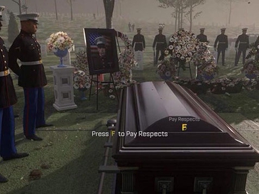
Credit to https://en.wikipedia.org/wiki/Press_F_to_pay_respects for the photo

That's not how we wanted to start the day. The rest of the timeline:

  • 4:15AM - Give doggos special-contingency frozen marrow bones. Sorry, doggos, no walk today. (They were pleased with their consolation prize)
  • 4:20AM - Instruct director not to jump off any nearby tall hills
  • 4:30AM to 5:00AM - Upload previous version of org. reports to every client's SFTP servers before 8AM EST
  • 5:00AM - 5:30AM - Share post-mortem with team and implement new SDLC process specific to Change Management around the org-reports system
  • 5:45AM - Drive to said director's home and have them pour me a glass of Balvenie such that we might lament together (and so they don't feel tempted to do anything irrational around surrounding, aforementioned tall hills)
  • 6:00AM - Chin up and continue iterating on SDLC whilst building epic products

The Solution

  • Now, organization reports have a 90-day communication period with clients for breaking changes
  • Any new fields added to these reports are optional for pre-existing clients who are subscribed, but can be enabled at their discretion. For new clients, all fields are enabled by default

Lessons Learned

  • Change Management processes around Production systems can be a critical step as an organization grows
  • Ensure you have someone who can supervise and ensure those Change Management processes are being followed
  • Heavily focus on documentation and training so that Product and Engineering teams are familiar with Change Management for these systems
  • Use a CODEOWNERS to ensure the right supervisors are notified anytime these systems change and ensure there are clear policies around merging code in these systems.

· 10 min read
Jason Walsh

Last week in an interview, I was asked how I might approach reviewing and improving an org's Software Development Lifecycle (SDLC).

SDLC - The Merry-Go Round Model

SDLC is often depicted as a perfect circle. Everything always moving forward perfectly, synchronously in a happy, little ♾️ loop. A Merry-Go Round, where every cycle means 📈 and 💸.

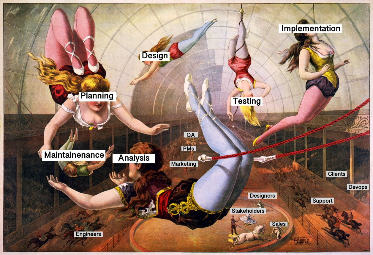
The Phases of the Lifecycle typically don't represent this, but, when working with new or existing projects, we're typically dealing with 7-9 personas, sometimes more. Stakeholders, Product Managers + Product Marketing, Engineers, Designers, QA / Testers, Devops, Support teams, sometimes Sales teams, and more.

sdlc-trapeze.jpg

It's less of a Merry-Go Round, but rather a Trapeze act. Success relies on the teams' interpersonal and cohesive strengths, trust and the organizational prowess of the ringleader.

There is a great deal of nuance from company to company, from team to team, and even from project to project.

· 2 min read
Jason Walsh

Mangrove helps homeowners find rebates and incentives so they upgrade their home to reduce their utilities costs and their climate footprint. Take a peek at Mangrove's user interface here.

This blog covers technical details about what was involved in building Mangrove.

· 5 min read
Jason Walsh

Mangrove helps homeowners find rebates and incentives so they upgrade their home to reduce their utilities costs and their climate footprint. Learn more about Mangrove's architecture here.

Here's a peek behind the curtains to what Mangrove does and how it works.